Your basket is currently empty!
Cowbridge Cars and Coffee 2024
Last Sunday was Cowbridge Cars and Coffee, set in a small town where cars take over for the morning. I hadn’t taken any photographs of cars in ages so decided to pop down hoping the weather would be OK. Luckily the rain held off and it was an amazing turn out with a huge variety of different cars.
Below is just a small selection of the cars, the full gallery can be found here https://scottsutton.net/photos/72177720320900041/


Creating an animated text gradient with CSS
This effect is ideal for creating an eye catching text heading and is quite simple to acheive with just a bit of CSS, or it could be used as a mouseover effect with a bit of a tweak to the code.
You can view an example here

The CSS
.gradient-text{
     font-size: 3rem;
     font-weight: 700;
     text-align:center;
     background: linear-gradient(to right, #f79533, #f37055, #ef4e7b, #a166ab, #5073b8, #1098ad, #07b39b, #6fba82);
     background-size: 200% 200%;
     animation: rainbow 4s ease-in-out infinite;
     background-clip: text;
     -webkit-background-clip:text;
     color:rgba(0,0,0,0);
}
@keyframes rainbow {
     0%{background-position:left}
     50%{background-position:right}
     100%{background-position:left}
}
The HTML
<div class="container"> <p class="gradient-text">Animated text gradient with CSS</p> </div>Neon Glow Border
This is a nice little neon glow border style that can be used on elements in a page to draw attention and its not too much code involved. It can be tweaked in loads of different ways to give some real interesting designs.
View the glowing neon border in action: https://scottsutton.net/additional-files/neon-border.html

The css:
.gradient-border {
  display: flex;
  flex-flow: column;
  align-items: center;
  justify-content: center;
  width: 600px;
  min-height: 300px;
  color: white;
  padding: 1.8em;
  margin-top: 5em;
}
.gradient-border {
  --borderWidth: 2px;
  --borderRadius: 20px;
  background: var(--bg-color);
  position: relative;
  border-radius: var(--borderRadius);
}
.gradient-border:after {
  content: '';
  position: absolute;
  top: calc(-1 * var(--borderWidth));
  left: calc(-1 * var(--borderWidth));
  height: calc(100% + var(--borderWidth) * 2);
  width: calc(100% + var(--borderWidth) * 2);
  background: linear-gradient(60deg, #f79533, #f37055, #ef4e7b, #a166ab, #5073b8, #1098ad, #07b39b, #6fba82);
  border-radius: var(--borderRadius);
  z-index: -1;
  animation: animatedgradient 3s ease alternate infinite;
  background-size: 300% 300%;
  filter: blur(10px);
}
@keyframes animatedgradient {
	0% {
		background-position: 0% 50%;
	}
	50% {
		background-position: 100% 50%;
	}
	100% {
		background-position: 0% 50%;
	}
}
The html:
<div class="gradient-border"> <p>Box with glowing neon edge</p> </div>Corrado: dash problems


You have to expect to gather a whole load of new problems when a car has been off the road for a while. The lcd displays and rev counter are playing up, with the rev counter hardly moving and the lcd screens showing weird characters. I have take everything appart and cant see anything obvious, so will have to do some google-ing to see if I can find any fixes.
Kingfisher at Hendre Lake
Frosty morning at Hendre Lake
Corrado: Replacing the Fuel Pump


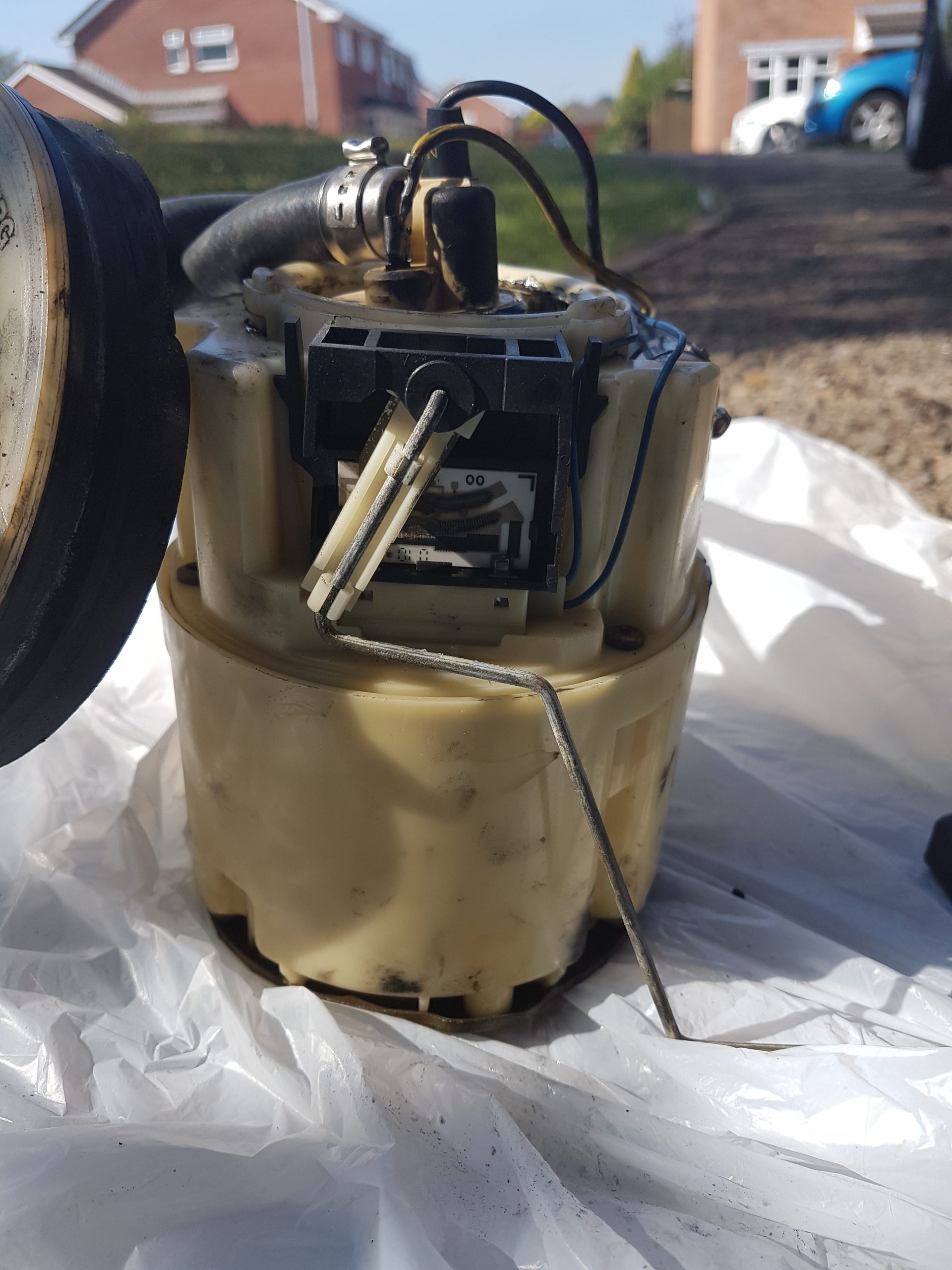
I had problems with the fuel pump not working at all so took it out and it was a proper mess. I replaced it with a new one which primed as soon as I turned the key which was awesome and it meant I didn’t have to deal with chasing down electrical gremlins. I just need a fuel level sender for it now . Sadly though it still doesn’t start, turns over but doesn’t even try and fire. The timing marks are all lined up and I’ve got a spark so will have to do some more fiddling about to see what’s up.
Corrado: Replacing The Water Pump


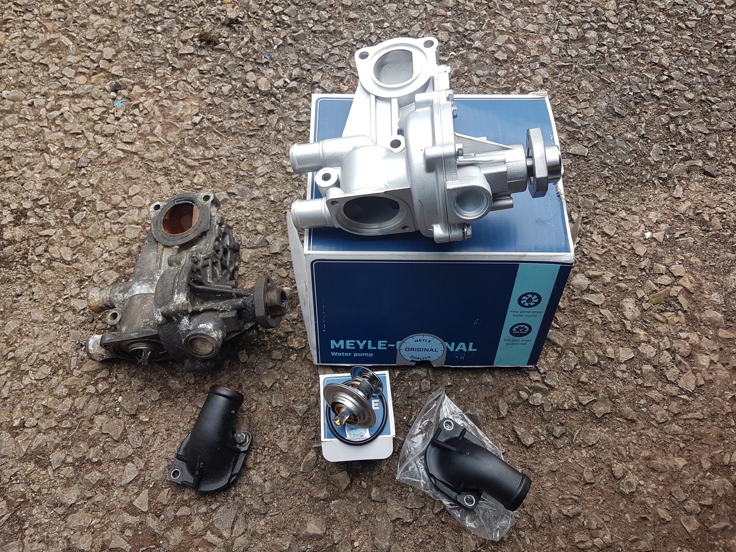
As the Corrado has been off the road for a while, it needs new belts, oil and coolant so I thought I may as well replace the water pump and thermostat when I’m at it. It’s a bit of a pain to do as you have to take the alternator and supercharger out to get at it, so takes a while, most of the time trying to find where all the bolts are. Hopefully I fitted it ok as I don’t fancy taking it all apart again if I find a leak.
Corrado Engine Mount and Bracket


So I hopefully found out why the coolant hose kept popping. The engine mount bracket had snapped and the bolts had fallen out, causing the engine to be able to move about a lot because it was only supported by the rear mounts.
I managed to find one on a facebook group (VW stopped producing them years ago) and bought a new engine mount to go with it. I dont know where the original mount came from (on the left) but it’s not the correct one for the car.


